Diploma project for my Higher Diploma in Human-Computer Interaction and User experience - 2021/2022

A website and a mobile app for a new supermarket chain in Ireland
Synopsis of the project
I created a website for a new supermarket chain in Ireland and also a mobile app. It is based on an idea I had about importing French biscuits to Ireland but not for some specialist shop or grocery store, but for a new large supermarket chain for Ireland.
The new large supermarket chain would have the whole range of French biscuits that can be found in supermarkets in France just like in Ireland they have the whole or a substantial range of British biscuits right now along with Irish biscuits. The supermarket website and mobile app would also need to be easy to use, clear and require few clicks from the user to find what they are looking for.
I carried out a comprehensive research into the large supermarket industry globally and for Ireland by doing a competitive benchmarking analysis for the websites and mobile apps of the 3 large supermarket chains that I found in Ireland; Tesco, Supervalu and Dunnes stores.
Project presentation and demonstration of the prototypes

I completed 2 user surveys to identify desires, behaviours while shopping for food online (whether they use a desktop website or mobile app, what is their favourite supermarket chain in Ireland based on the usability of their website and of their mobile app etc..), needs and asked the users if they were interested in the product.
Out of 57 respondents:
54,4% said they would like to see French biscuits in the supermarket chains.
45,6% said they would go to the supermarket that has the French biscuits for their shopping.
Out of 27 respondents:
55,6% found the Tesco website the easiest to use in comparison with Supervalu and Dunnes stores websites.

I gathered all the information obtained during the research and tried to find commonalities between the users stories, experiences, statistics and created a user story map/affinity diagram and one customer journey map for both the desktop website and the mobile app.
In this case , the journey steps that the user would take to find the French biscuits were the same for both.

I then made sketches and wireframes based on the research and used each step of the customer journey map to create one wireframe and then proceeded to create mockups of the desktop pages and mobile app pages.
As the mockups are high-fidelity , they can be used for a high-fidelity prototype so I used them to create a high-fidelity prototype for the desktop website and the mobile app.

I also incorporated a design innovation (for both the desktop website and the mobile app) that cannot be found on other supermarket websites and rarely on any other shopping websites and websites that have products/services to sell , which is is to have a pop-up window whenever the user wants to have more information about a product.
For this project, when the user is on the results page where they see a list of products , they can see a bit of information about the product such as the title and then an hyperlink ‘Read more’. Upon clicking that hyperlink , a pop-up window opens up with the full description of the product.
The user can then close it and continue browsing through the results page without having to be redirected to a new page each time, it gains time for the user as it allows them to browse faster through the products to find out more about them without having to go back and forth between the pages and subsequently leaving the website or mobile app to find another website/mobile app that can deliver the information they need faster.

The final aim was to create a high-fidelity prototype for both the desktop website and the mobile app.

My project was to go through one cycle of the UX design process which took me between 4 to 5 months.
The process is then repeated indefinitely every 3 months for example with different research methods that lead to new wireframes and prototypes that are handed to the developers so they can release a new version of a website and/or of a mobile app.
Below are the full details of the project along with the prototype links but here they are again:
High-fidelity prototype for the desktop website :
https://xd.adobe.com/view/e0a6a00d-34a5-4eb0-82fd-4bb3d53e5196-b5f5/
High-fidelity prototype for the mobile app:
https://xd.adobe.com/view/2e4ec1eb-0150-4697-a754-553744a53570-7b1d/
A website and a mobile app for a new supermarket chain in Ireland - Project full details
UX design Research and Process explanation
I feel everyone likes biscuits but customer surveys would be an ideal way to find out what the customers in Ireland want by simply asking them if they would like to have more biscuits in their supermarkets and if they would like to have the whole range of mainstream French biscuits brand alongside the mainstream British/Irish biscuits. I could show some photos of these biscuits , I have already selected quite a few from Carrefour.fr , which is a large supermarket chain in France and also has a presence in many other countries. However for the project I will try to aim for 20 maybe 50 people if I can to fill out the survey. In reality hundreds or thousands of surveys would be better but I feel if 20 or 50 persons want the same things, it could be possible that hundreds and thousands would want the same things. Of course it is just a probability, we can only know after doing the survey and doing it with more and more people may get different results. Generally it can give an average of what people want. I cannot see people saying no but again surveys can mean nothing as in UX we learn that whatever the customers say is irrelevant and we need to watch what they do instead. They could say they all want French biscuits but never buy them once they are available. However UX is a process that can be done several times and forever , so if it doesn’t work the biscuits could be removed and more research can be done again on the customers' needs and adapt the offer to their needs.
Usability testing
To watch what the customers do, usability tests are a good option however they can cost a lot. I did that in the past for my professional Diploma in UX design but for a company it is different , as they would hire people or even get a recruitment agency if the company is big enough , to hire candidates willing to sit for one hour and try a website while they are being filmed and the UX researcher would also be present and take notes of the customer reaction, ask them questions. It is hard for a UX designer student to find friends/family willing to be filmed and for one hour asking them questions and to go through a website. I did not want to do that for this project as I couldn’t find anyone for my previous project and had to do it with my sister who is an actress and maybe for that reason she said she didn’t mind being filmed. However she lives in France and her English was not that great regarding technology terms or internet terms such as ‘browsing’, ‘tab’ etc.
I know how to conduct these tests and could do them in reality for a company or hire the people. These tests can be run once the website is up and running , however they would cover the whole website not just the biscuits section but we could ask the person to find the biscuits section and see what they do once the page is open.
A/B testing
Another test to see what the customers are doing is the A/B testing. For example it could show two different versions of a website , or a function, section on a website or even a page. If we are not sure of the UX/UI of a homepage for example and we want to make sure that the customers register an account with us. The A/B testing would have in this case two different homepages that have a different layout and the ‘registering an account with us’ section/buttons in different places. One homepage version would be shown to half of the customers visiting the website and the other homepage version would be shown to the other half of the customers visiting the website. The customers would not know this but behind the scenes what they do would be recorded in the website stats/analysis. Changes can be made based on results, for example on which version of the homepage more customers registered an account with us. If none , the homepage can be altered again and the A/B testing can be done again and again until the customers register an account.
These tests however are done once the website is built but before the customer user journey map and affinity diagram or user stories are done in order to build the website, the prototype. Technically the website is not being built and the prototype could be used for Usability tests and A/B testings (however it would not be available online so the A/B testing would need to be done while doing the usability test).
Once the website is published , the website stats/analysis will also show what the customers do.
Competitive benchmarkings
The first part of the research is to compare , do an analysis on the largest supermarket chains websites in Ireland which is called competitive benchmarking. It is a deep analysis/review of main/key pages of a website with a UX perspective and also a UI one. What looks good or not and what works well or not , when trying the website. It is generally divided into a pros and cons section and the pros section would have the colour green while the cons section would have the colour red . These colours are being used throughout the analysis to pinpoint /highlight areas of a website. A separate competitive benchmarking is necessary for mobile apps .
It can be really helpful and helps to gather a lot of information about competitor’s websites and allow you to build a better , more effective website that addresses all the issues other competitors are having and emulates the effective parts of the competitor’s websites.
Surveys
The second part involves surveys on a percentage of people/ users . The users should be targeted ideally so that they know how to use the Internet for example and how to browse a website . As part of a diploma project , it is not really possible to get hundreds or even thousands of surveys completed by relevant users which would be the best . A company would need to hire a third party company to distribute the surveys to relevant users . However 20 surveys could be an ideal number to start to show a pattern, if for example 18 out of 20 surveys say the same thing , we could assume that if we did 100 surveys, 90 would say the same thing but of course we cannot be sure about it until we actually do it.
The surveys should have a mix of free hand open questions and multiple choice questions, they can be done on free surveys providers such as survey monkey or google form.
Personas
The third part can involve more personas, usability tests and all of these are qualitative research meaning that it is focused on fewer users and go into details of someone’s personality for the personas for example. I have explained the usability tests above , the pros and cons and what they are. However it is not mandatory and depends on what the company wants, there are many ways to do a user research.
User story maps/affinity diagrams
Once the initial research has been done, which is what we discussed above , we need to gather all the information we obtained from the competitive benchmarking, surveys, usability tests, A/B testing, personas etc..and create a user map or also called affinity diagram. This is done by a team of UX Researchers , especially in large companies. They would hire several UX researchers and UX designers or at least a few of them for each part (The research part and the design part). The UX researchers would work collaboratively on this task and write on post-it notes detailed information given by the users or obtained through other means of testing such A/B testing or competitive benchmarking where the UX researcher gave his or her own opinion as a potential user of a website or of a mobile app, this research method is also called a heuristic evaluation.
The UX researchers would then put up the post-it notes on a wall and would create/name categories and then move the post-it notes around into the relevant categories or the closest fit for the post-it note. It can also be done remotely using the online software Miro which was created as a collaborative tool, diagrams and maps can also be done on it and a white board with post-it notes can be shared among co-workers to work on the grouping progress remotely.
Customer journey maps
The fourth part of the research is to create a customer journey map from the post-it notes that we gathered into categories. The categories can be the journey steps for the map, the steps that a customer follows while browsing a website. Many post-it notes would have the same information, some more important and some less. The same information should be summed up into one information. Once the customer journey map is done, we can do a user flow map to find out the more common path a user would follow when browsing through a website. However that part can be skipped if we don’t have much data or user surveys for example as the most common path would be obvious from the user story map where the post it notes are being gathered into categories. Large companies with large research data could also find a few common flows that customers follow when browsing a website and could do separate prototypes and wireframes based on these most comme flows. Smaller companies and depending on the services they offer may have only one most common flow their customers follow.
UI Sketches
Once the most common flow a user follows when browsing a website has been established , the UX designer will work on UI sketches before starting on the wireframes that are based on the UI sketches ( showing emplacements of text, tabs, bars, buttons, images on a webpage). The UI sketches would be the steps that the customer follows therefore the pages they are browsing through. These sketches can be skipped but they give a good idea of how a page would look like. The sketches can be simple with less detailed information than the wireframes.
Wireframes
Each UI sketch will be turned into one wireframe , that is a digital version of the UI sketch. It can also be simple or be more detailed visually but what’s more important is that they contain detailed information of what the buttons, interaction, tabs etc along with detail of what fields should ask for. A field could be in a ‘register an account’ form, so the wireframe should explain to the developers that they want a password for example that has a minimum of 6 characters, one capital letter and one sign, not a letter and give examples of accepted signs . UI information such as font size, font type and whether the fonts should be bold etc and colours of fonts and backgrounds , tabs, buttons should be given as an hex number which is the number the developers would use when coding. Adobe XD and Figma softwares provide these numbers for the colours.
Prototypes
Once the wireframes have been done , the prototype can be started. The prototype can be either a low-fidelity prototype, a medium-fidelity prototype and a high-fidelity prototype. A low-fidelity prototype is probably the most cost-effective one but doesn’t provide much detail on how the final website should look like. It is basic and can be done using black and white for example and showing the basic interactions from the user flow. Smaller companies that have a limited budget and time could want to opt for that one. A medium-fidelity prototype is somewhere in between a low-fidelity prototype and a high-fidelity prototype. It is not that expensive and doesn’t have too many details or not enough details. However it is more expensive than the low-fidelity prototype and more time-consuming. A high-fidelity prototype looks exactly like the final version of a website, it is really expensive and more time-consuming. However it is the best option if a company can afford it. For this project I will do a high-fidelity prototype for both the website and the mobile app.
Logo
Firstly I created a logo for the supermarket and wanted something simple. I tried a few iterations in Adobe XD using different fonts and came up with the following logo. I wanted the logo to have an Irish name and the colours of Ireland since the supermarket would be in Ireland and Irish . The fonts I chose in the end (circled in red in the image below) are clear, simple, cheap and indicate a large supermarket.
Logo made with Adobe XD
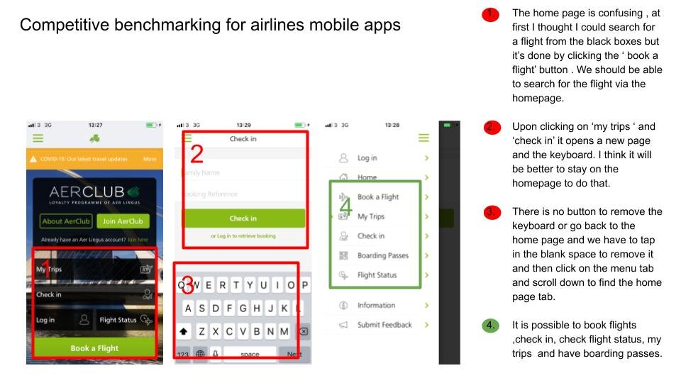
Competitive Benchmarkings
I started with a competitive benchmarking that allowed me to review and compare the 3 largest supermarket chains websites and mobile apps in Ireland. I came up with several similarities, necessary and unnecessary features. The report I made is quite comprehensive and contains an analysis of the key pages of each website and mobile app (view examples below) . I found that the tesco website and its mobile app was the best both for the UI and the UX. It was convenient, easy and fast to use. I didn’t find many irrelevant ads or content and was able to find the products and the information easily. The tesco website seemed less appealing than its mobile app however. I preferred the mobile app UI and used it as an inspiration for my supermarket mobile app.

Competitive benchmarking for desktop websites made with Adobe XD

Competitive benchmarking for desktop websites made with Adobe XD

Competitive benchmarking for desktop websites made with Adobe XD

Competitive benchmarking for mobile apps made with Adobe XD

Competitive benchmarking for mobile apps made with Adobe XD
Surveys
I did two online surveys using Google forms to find out about the customer needs and behaviours. One survey was centred about the product that I wanted to propose in a new large supermarket chain in Ireland that was a whole range of French biscuits on top or the Irish and British biscuits range.
The second survey was centred around website and mobile app usage but both surveys had questions about online shopping to find out whether this is something that users do. The second survey had an open question about it where users could describe an experience they had while shopping online even though I had asked if the users shopped online for their groceries in the first survey. I wanted to see if the actions match the words , so the second question was the action.

Survey 2 made with Google forms
For the first survey I managed to get 57 responses more than the average I had planned (20 to 50 responses ).
I was surprised that even though the majority of shoppers declined to use my supermarket for their regular groceries shopping, if there were a whole range of new French biscuits , 45.6% of respondents would go to my supermarket which is quite an important number and almost half of the people. Maybe if there were more respondents such as 200 or even more, the result could shift. So I feel the 45.6% is not necessarily a reflection of the minority but it could be the majority of people.

Survey 1 made with Google forms
It did confirm my initial research and the comment from that French economist who works in the consumer field. He said to bring people to your new supermarket , you would need to have the lowest prices but also a product that the customers cannot find elsewhere.
I didn’t ask about the lowest prices in the surveys as the focus was the new product.
I also found out that most people 80.7 % of the 57 respondents do not shop for groceries online which is interesting. However the supermarket chains still have websites and mobile apps.

Survey 1 made with Google forms
For the second survey , I managed to get 27 responses and asked questions about their behaviours whether they use a mobile app or websites . They seemed to use websites over mobile apps in the majority but both are being used. I asked the users to have a look at the supermarket websites and choose which one they feel would be easier to use and the majority chose Tesco, 55.6% of the 27 respondents.
It is quite an important number considering the two other supermarkets were chosen by 25.9% and 18.5% of the rest of the respondents.
That finding confirmed my previous analysis from the competitive benchmarking that the Tesco website was the best.

Survey 2 made with Google forms
User story map/Affinity diagram
I then used all the data from the online surveys responses and the competitive benchmarking to create a user story map/affinity diagram.
I tried to gather them under common categories to understand the goals, behaviours , issues and even interests of the users. I used Miro with virtual post-it notes to organise the data, unfortunately the software doesn’t offer the download as JPEG or PDF for free anymore so I was only able to take screenshots.
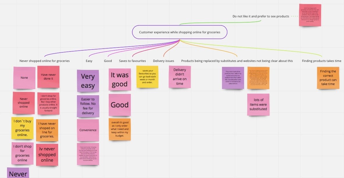
User story map made with Miro
Customer journey map
After gathering all the data , I created a customer journey map for a user scenario, the user scenario was to shop for biscuits especially the French biscuits (The French biscuits would be the first biscuits to show up in the search results of biscuits page) which was the most common path that the users would follow when using my supermarket website or app from the survey results and based on the product offer.
The customer journey map detailed the steps /actions that the user would take/make on both the website and the mobile app including their goals , context , behaviours and pain points/issues with an overall scale using smileys to rate the experience of each step/action as either positive or negative.
I based this customer journey map on a customer journey map model that I followed for a project during my professional diploma in UX design. I made that map in Figma.

Customer journey map made with Figma
UI Sketches
I proceeded with some UI sketches for each step/action for each website and the mobile app. I did one screen per action/step. At first I wanted to do them on paper but I came across an erasable white board in a shop ( incidentally that I used in France at school when I was young, ‘une ardoise velleda’ was exactly what the teachers asked the parents to buy) . I thought it would be easier and faster for corrections and since nothing is set in stone regarding sketches or wireframes, we could use any medium.
I had a fairly good idea of how the pages for the website and the mobile app should look like and what features should be there but stil would make a few corrections as I created them. I also added some basic information.

UI Sketch of the desktop website Sign in/Register page

UI Sketch of the mobile app biscuits section page
Wireframes
After that I used the UI sketches for my wireframes , to make medium fidelity wireframes . I took photos of the UI sketches and uploaded them to Adobe XD in order to make the medium fidelity wireframes, I added more details and also made some changes such as adding buttons I had forgotten.
Further down the line I made a pop up window available for the description of the product so that the customer doesn’t leave the results page and can quickly find more details about the products. My diploma project supervisor asked me to come up with a design innovation that was not used by any of the supermarkets websites and mobile apps, so I thought about it for a while and then realised none of the supermarkets had a pop up window for the product’s descriptions, their descriptions would open in a new page which could hinder the use experience as they generally want to browse through products fast.
I modified the wireframes several times to reflect all of these changes.

Biscuits page wireframe for website made with Adobe XD

Mobile app wireframes made with Adobe XD
Mobile app wireframes
After that I did another iteration of the wireframes for the mobile app UI as I thought the sketches looked a bit messy and used Balsamiq for them ( I discovered that software in the UX/UI module after I had done my prototype for the website so thought I would do the sketches again before starting on the mobile app prototype.

Low to medium fidelity UI sketches/wireframes for the mobile app made with Balsamiq
Desktop website prototype
Based on the mobile app and the desktop website wireframes , I started to proceed with building the prototypes.
I started to build first the prototype for the desktop website , I searched the internet for some images for the supermarket aisles along with black and white icons and colourful icons from the website flaticon.com to use for the menu tab.
I had a good idea already from the wireframes where to place the components and text , however I did have to make a few changes along the way such as with the layout of the homepage for example so that it fits the desktop frame. The pages I made are high-fidelity and can be called and used as a mockup of the website key pages that reflects a path ( in the above customer journey map ) the customer will follow when using the website.

High-fidelity homepage mockup for the desktop website made with Adobe XD (view UI portfolio for all mockups)
I made these mockups on Adobe XD along with the prototype , I added arrows on each page to show the clickable parts.
The final prototype for the desktop website can be viewed at this following link :
https://xd.adobe.com/view/e0a6a00d-34a5-4eb0-82fd-4bb3d53e5196-b5f5/
Mobile app prototype
For the mobile app prototype, I also used Adobe XD and created a high-fidelity prototype and mockups at first just like with the desktop website.
Using Balsamiq to do a second set of wireframes helped me visualise the layout and build the pages more accurately without having to make a few changes. When I did the prototype for the website , I had not discovered Balsamiq yet so couldn’t do another iteration of wireframes but I did them in my mind and then made the necessary adjustments along the way.

High-fidelity shopping page mockup for the mobile app made with Adobe XD (view UI portfolio for all mockups)
The final prototype for the mobile app can be viewed at the following link:
https://xd.adobe.com/view/2e4ec1eb-0150-4697-a754-553744a53570-7b1d/
High-Fidelity wireframes for mobile app

Mobile app high-fidelity wireframes made with Adobe XD and Balsamiq

Mobile app high-fidelity wireframes made with Adobe XD and Balsamiq
Team project for my Higher Diploma in Human-Computer Interaction and User experience - 2021/2022
As part of my Higher Diploma in Human-Computer Interaction and User experience , I had to do numerous assignments/projects that involved either coding with Java or Javascript React specifically for a mobile app development module, multimedia communications and technology modules and projects related to the User experience and 3D designs (view UI design portfolio) including coding with C#.
In this team project that lasted a semester , we assigned each team member a role. We were six team members from different diplomas since I was the only one from my diploma, I decided with the agreement of the team to be the UI/UX designer and they to be the software engineers. We worked in an agile environment using the JIRA online software to organise and set up the team’s tasks. We mostly worked remotely since some of the team members lived in a location that was far from the campus whilst others preferred to work on the campus but we communicated online. The JIRA dashboard was accessible by all the team members and all the team members had the possibility to modify the tasks and add tasks if they wished to. We would meet online every week for a short discussion of our progress and what needs to be done over the next week.
Each member of the team came up with an idea for a web app and then we had a vote, half of the team members came up with a web app that was relevant to our studies/ university and the other half of the team members came up with a web app that had no connection to our studies/university. My idea was quite complex, a department store and was not chosen along with a messaging app and a reading list app. The complexity and feasibilty of these three apps were discussed ahead of the vote and may have influenced the outcome of the vote. The web app that got the more votes turned out to be a Study Partner Finder, a desktop utility web app that would help and connect students within a university, course, modules so they can study together.
Since I was knowledgeable about Miro , I helped the team about it and created a board and also clarified the task we had to do about gathering user stories. We all gathered user stories and I copied the stories from all the team members into the board. I then created relevant groups so we could gather the stories into them to create a user story map.

The shared user story map with Miro

The user stories grouped into categories
Once we gathered all the stories into the relevant categories , I started creating UI mock up pages (in my UI design portfolio) for key pages but ended up doing them for most pages so we can have a good idea of the navigation. The mock up pages were based on the story map, I focused on the best customer journey , the more common one that a customer/student would follow when using the web app. After that, I made a medium to high fidelity prototype in Adobe XD with most of the menu tabs and buttons working.
Here is the link to the prototype:
https://xd.adobe.com/view/66a8a841-f6c9-47e2-a72f-9048bcd39f1f-33fb/

Prototype being made with Adobe XD
Low-fidelity wireframes, User stories, Personas for my UX, UI design module for the Higher Diploma in Human-computer Interaction and User experience 2021/2022
These low-fidelity wireframes were made on Balsamiq and are clickable when exported as a PDF file, it can be used as a low-fidelity prototype and it’s an easy and fast way to show your ideas to the stakeholders. Anyone who isn’t tech savvy can open this PDF and be instructed to click on the parts that are clickable. The software allows for marking where the parts are clickable which is really handy. My assignment consisted in researching and in creating a mood diary app including these 5 first draft of low-fidelity wireframes. It was fast enough and took me about an hour. I feel it is quicker than Abode XD and Figma so for low-fidelity wireframes this is probably the best tool.
As part of the assignment , I had to write a short description of two typical users of a Mood diary app.
As part of a second assignment , where I had to work as part of a team and also individually I made the user personas, the extra feature wireframe and the clinician App wireframes. We also had to review each other work and select what we will submit as we had to submit as a team. We had tight deadlines but we managed to finish everything on time. I also led the group along with another member and started to set internal deadlines so we can advance to finish it on time and had the agreement of my tutor. Unfortunately not everyone participated in every part but generally there were 8/9 team members active out of a team of 13 persons. In the overall it went well, and I was able to guide a bit and help my team members along with the other team member who also led the team. We were both responsive and somehow able to be fast and therefore encourage people , share information we had within the team. The communication was clear and easy and we were all really happy with the results.
User profile A:
User A feels anxious all of the time and finds it very hard to live a normal life. User A is anxious as soon as they get out of their home and set foot on the pavement. Whilst User A doesn’t feel they have a serious issue , they feel highly uncomfortable doing normal activities such as walking on the street, taking public transport , shopping. As a result of doing these activities or simply going on about their daily life, User A sometimes has panic attacks suddenly and cannot breathe anymore properly and may feel dizzy. User A doesn’t want this to happen again out of random and doesn’t know why this is happening. User A wants to be able to better control what could trigger their anxiety attacks and how to avoid them in the future. User A wants to use the app in order to track their mood on a daily basis and track activities, events that may trigger panic attacks. User A is also interested in doing Self-help exercises. User A however is quite health conscious and eats well, drinks 1.5 to 2 litres of water per day and sleeps at least 7 hours per night but most of the time they sleep for about 8 hours so on average they sleep between 7 to 8 hours per night. Their main concern is their panic attacks and their general anxiety. User A is not in touch with any specialist and was told by their general doctor that it was all in their head and that they had no medical issue so User A wants to try to resolve the issue themselves.
User profile B:
User B has been seeing a psychiatrist and been diagnosed with a mental health condition such as bipolar disorder. User B is taking medication on a daily basis for their mental health condition, User B is not sure whether the medication has a positive or negative effect on their mood and is also concerned with side effects. User B has had side effects from taking a medication for their mental health condition and wants to stop taking any medication altogether. However the healthcare provider of User B doesn’t see any alternative and is not sure about the side effects and triggers and asked User B to document this and to keep some sort of diary of how User B feels before and after taking the medication. The healthcare provider asked User B to be sent a detailed weekly report of the diary including insights and charts of the information that User B shared with the app. User B wants to use the app mainly to track his medication and also to download regular PDFs reports of insights and charts from the information they provided so they can share these reports with their healthcare provider. User B also wants to use the Mood tracker for themselves and the self-help exercises so they can learn how to feel better and manage their mental health condition without having to take any medication anymore.

Low-fidelity wireframe for my UX module assignment made with Balsamiq, the wireframes are saved as a clickable PDF

Low-fidelity wireframe with information about how an additional feature works for my UX module team project assignment , made with Balsamiq

Mood Diary App user persona made with Figma

Clinician App user persona made with Figma

Low-fidelity wireframe (example 1) of a clinician desktop web application made with Balsamiq, the wireframes are saved as a clickable PDF

Low-fidelity wireframe (example 2) of a clinician desktop web application made with Balsamiq, the wireframes are saved as a clickable PDF
Projects for my professional Diploma in UX design - 2020
The projects below were made as part of my professional diploma in UX design done with the UX design institute in partnership with UCD.
The aim was to create the best airline website possible and research, find the goals of the users/customers and then design and create a medium fidelity prototype along with wireframes.
I started with a competitive benchmarking of some of the most popular airlines and hotel booking websites to see how they compare , what they offer, how do their sites work and list what are their pros and cons.
I then did an online survey with 5 short questions in order to find out what people want to do when they visit an airline website and why do they visit it and whether they are able to complete what they want to do. I carried a few usability tests remotely and recorded them via Zoom where I asked the users to try two more popular airlines websites (different ones than the ones I used for the competitive benchmarking so I could get more insight) . After this I took detailed notes of the interviews I did by listening to the recordings.
After gathering all the information I made up an affinity diagram on Miro with other colleagues where we all shared the information we collected during our researches. Each of us wrote/typed on post-it notes on the board the results of our researches and we then proceeded by categorising them into different steps that a customer follows while booking a flight.
I then used that affinity diagram to create a customer journey map showing the goals, behaviours and pain points for each step of the booking process. I first sketched the map on paper and then added some colours before creating the final map on Miro.
After this I created a user flow diagram on Figma showing the best user journey/flow possible when booking a flight and then proceeded by creating sketches on paper for the interaction prior to creating a medium fidelity prototype , one for desktop and one for mobile based on the best user flow. The prototypes projects have more information about them and can be tested. Then I created wireframes for each desktop and mobile prototypes, I used Adobe XD to create the wireframes for desktop and Figma to create the wireframes for mobile.


Video game prototype for Zakki, a charity based in Indonesia
This is a project I did in collaboration with a team , however I did most of the graphics including the characters. I volunteered for a charity called Zakki based in Indonesia to help them create a video game to educate the young people. I worked mostly on the graphics and UI and made a prototype out of the UI screens.
The prototype ends at the ‘Play’ button that is not clickable. You will need to click the buttons to go through the screens and if you click anywhere in the screen , it will highlight the areas that are clickable.